App design, iOS engineering, data pipeline, landing page
Team
Solo (friend as client)
Tools
SwiftUI, MapKit, SQLite, Python
Interactive sketch
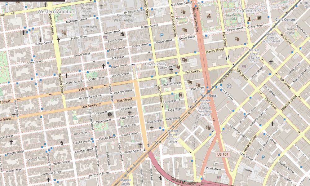
San Francisco, CA (7516)
D+87
Solid Dem in 2024
93% Dem7% Rep
Why I built it
A friend of mine was moving to New York and wanted to actually know the neighborhoods he was considering before signing a lease. He makes political maps for a living, so he knew the data existed. It just lived in datasets and desktop tools. I built Precinctly to put it on a phone: it shows the voting history and demographics of the precinct you are standing in.
The user flow
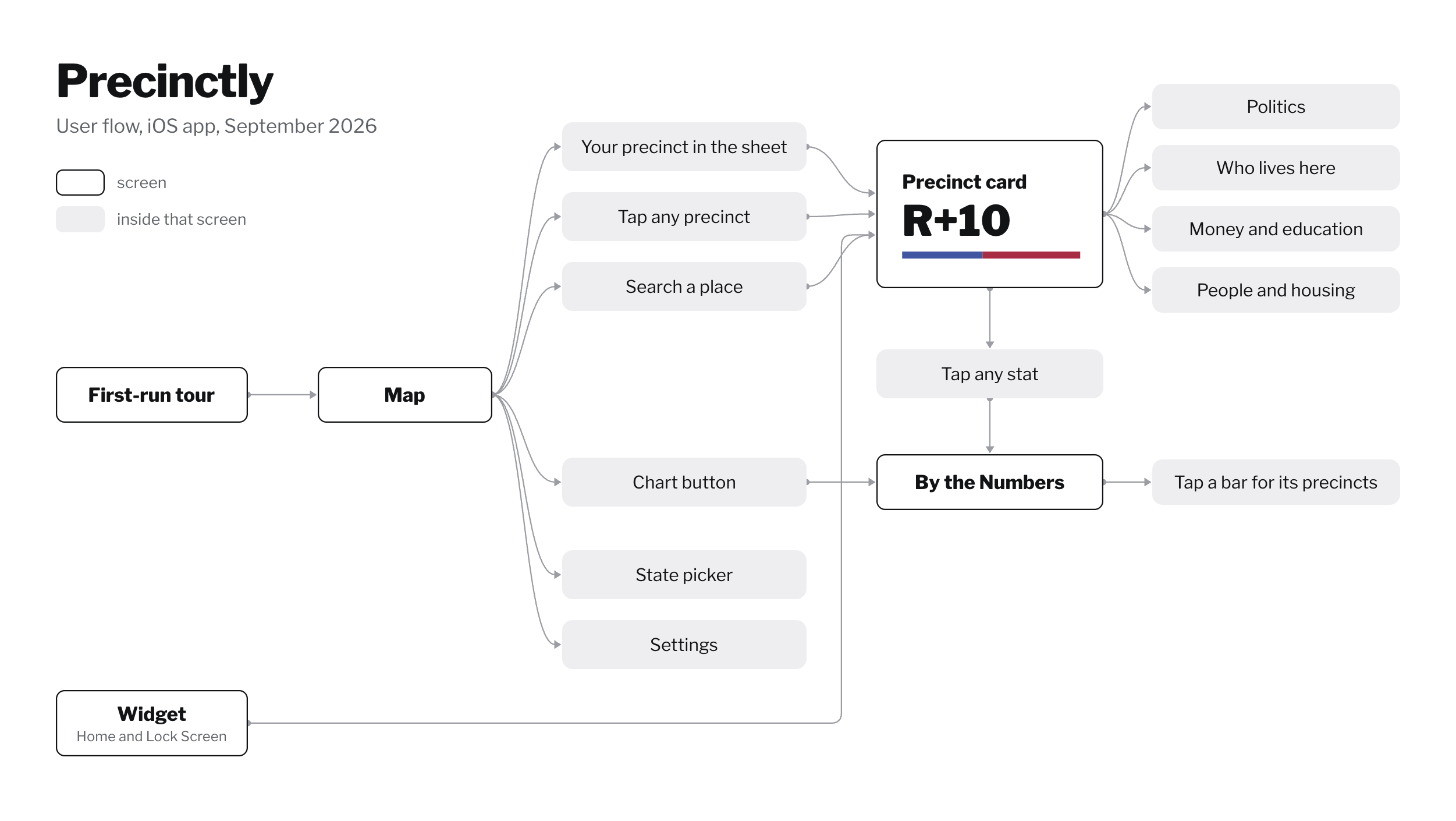
The app works like a weather app for political data. It opens to a map centered on you, with a bottom sheet already showing your precinct's lean. Tapping any other precinct, searching a place, and checking the home screen widget all lead to the same profile: the lean, the presidential trajectory across past elections, who lives there, and income.
Every path ends at the same precinct profile.
The design system
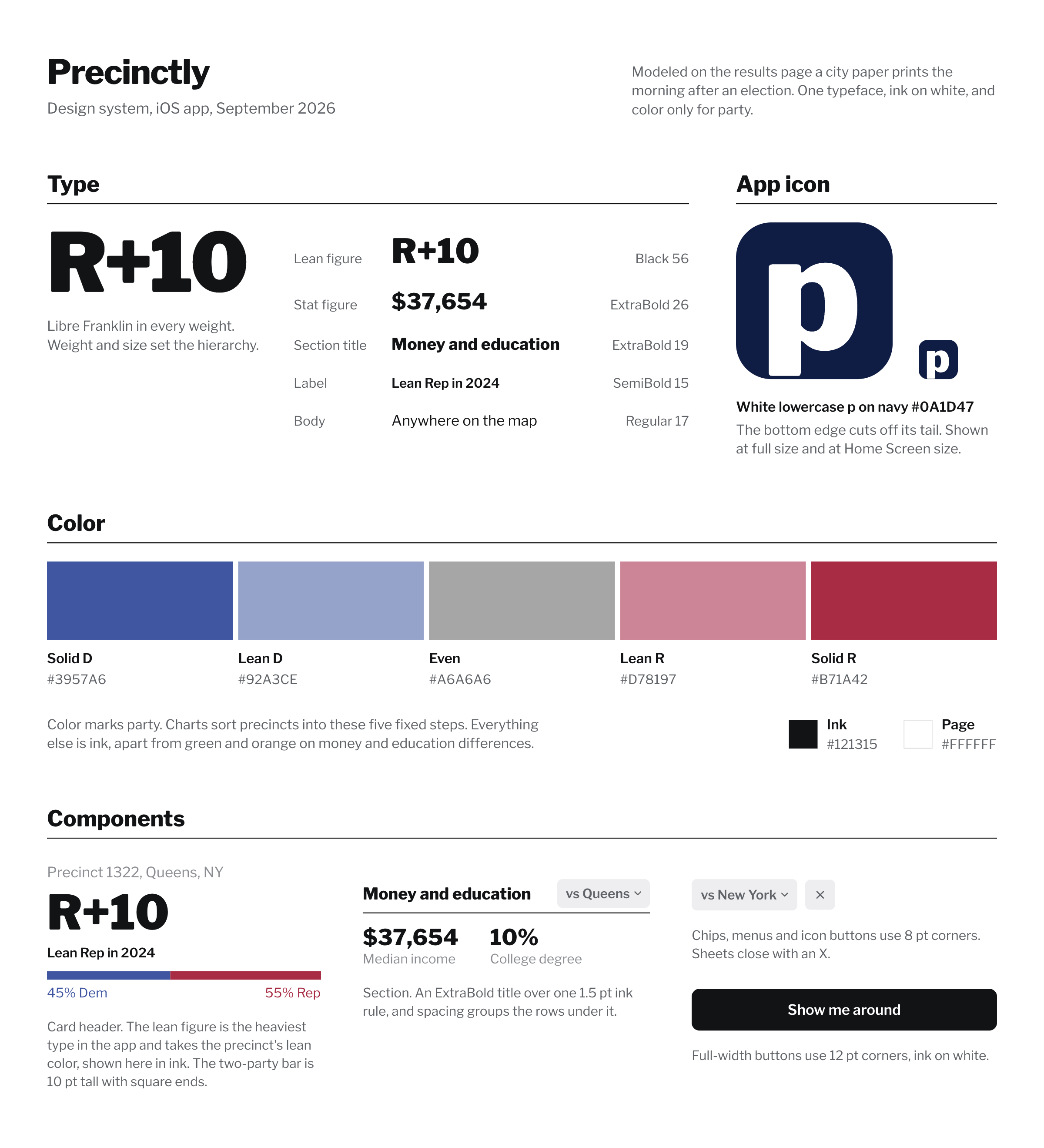
I based the design on the results page a city paper prints the morning after an election, with a heavy figure for each place, a plain label under it, and a rule between sections.
The app uses one typeface, Libre Franklin, in every weight. Weight and size set the hierarchy, so the lean figure is the heaviest thing on screen.
Color only marks party. Charts sort precincts into five fixed steps, from solid blue through gray to solid red. Everything else is ink, apart from green and orange for the money and education differences.
Each section is a title over one ink rule, and spacing groups the rows under it. Chips use 8 point corners, buttons use 12, and sheets close with an X.
The icon is a heavy white lowercase p on navy, and the bottom edge cuts off its tail.
From his data to a public app
The first version ran on my friend's private precinct shapes plus public Census data, which was enough to prove the idea. I could not ship his work files, so he helped me find the public versions of the same shapes and I rebuilt on those. I did all the building solo, with him as the client. I would build for a weekend, show him, and adjust from his feedback. A working version took about a week. The rest of the two months went to UI, speed, and where the data should live, since this was my first app and all of that was new to me. I also designed the app's interface myself and built the landing page for it. He was moving in August, so I had a real deadline.
Making 54,718 precincts fast on a phone
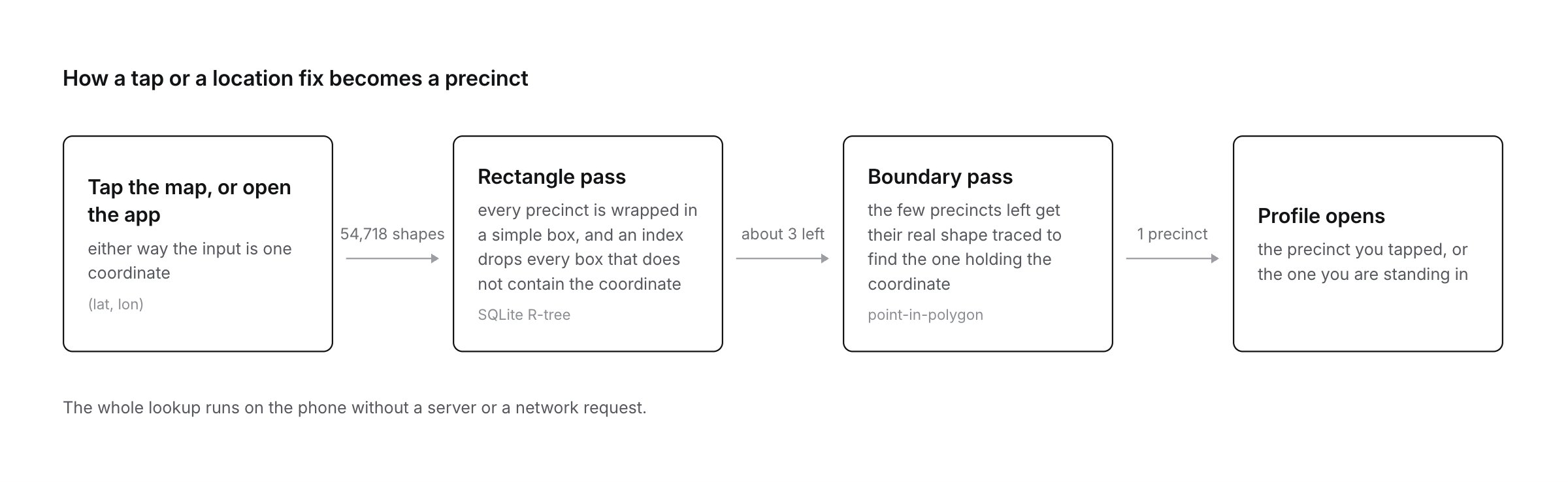
Everything is stored on the device, so a lookup never talks to a server. The catch is that finding your precinct means checking your location against 54,718 polygons, and precinct boundaries are detailed shapes with hundreds of corners each. Checking them one by one was too slow for an app that should answer the moment you open it. This was also my first time using SQLite, so I had to learn how a database handles shapes at all.
The fix is a two-step lookup. First, every precinct gets a plain rectangle drawn around its shape. Checking whether a point sits inside a rectangle is nearly free, so an index of those rectangles, called an R-tree, lets the database instantly discard every precinct whose rectangle does not contain you. That cuts 54,718 candidates down to a handful. Second, since rectangles overlap near borders, the app traces the real boundary of each remaining precinct to see which one actually contains your point.
The expensive boundary check ends up running on a few shapes instead of 54,718, so a lookup feels instant. I started with California, New York, Texas, and Massachusetts, the places my friend and I actually spend time. Since then I have added Colorado, Oregon, and the DC area, meaning the District, Montgomery and Prince George's Counties in Maryland, and Northern Virginia. More states mostly means finding public data and paying for it in app size.
Edge cases
Search is where the messy inputs show up. An address can sit outside the covered areas, and a GPS fix can land where no precinct exists, so the app checks for both and tells you which areas it covers. When precise location is off, iOS only shares a rough location that could land in the wrong precinct, so the app asks for one-time full accuracy and the widget falls back to its cached precinct.
When a precinct has little or no data, the app says so. If only 40 ballots were cast somewhere, it prints "only 40 votes cast" next to the lean, and missing values show a plain dash. A small test suite checks known locations against the bundled database to catch these cases if they ever break again.
Getting the Census data right
The data pipeline joins election returns with Census voting districts, and the Census surprised me twice. Early on the app ranked one precinct the richest in its area, and it took me a while to learn the Census stops counting household income at $250,000. Around 440 precincts sit at that cap reporting the exact same "$250k+", and there is no separating them.
The second surprise was race. The Census asks about race and Hispanic origin as two separate questions, so the shares overlap and can add up to well over 100 percent, and the columns I have cannot be forced into one clean total. The app calls both out. Income shows as "$250k+" once it hits the cap, and an info box in the profile explains why the race numbers overlap. The widget has been on my home screen since it started working, and I like seeing it update from time to time.
What is next
Precinctly is now available on the App Store. More states are on the list next.